使用 Docusaurus 作为文档站和博客
初始化站点
使用 create-docusaurus 脚手架初始化一个 Docusaurus 站点
要求
Node.js >= 20.0
$ npx create-docusaurus@latest [name] [template] [rootDir]
-
name:站点的域名,也是项目中package.json的name键。 -
template:站点模板,有多种选择Docusaurus 本身没有任何功能,所有功能都是由插件提供的。文档功能由
plugin-content-docs提供,博客功能由plugin-content-blog提供,页面功能(提供独立页面)由plugin-content-pages提供。通常不需要手动配置每个插件。模板已经包含了常用的插件(文档、博客、独立页面)。如果需要其他插件可以手动安装$ npm install --save docusaurus-plugin-name然后在配置文件
docusaurus.config.js中配置插件export default {
// ...
plugins: ['@docusaurus/plugin-content-pages'],
};classic:使用经典模板,包含文档和博客功能。facebook:Facebook/Meta 的模板- git 仓库(以
https://或者git@开头) - 相对于当前目录的相对路径,包含要复制当前目录的文件。
-
rootDir:项目的根目录(默认是当前目录)
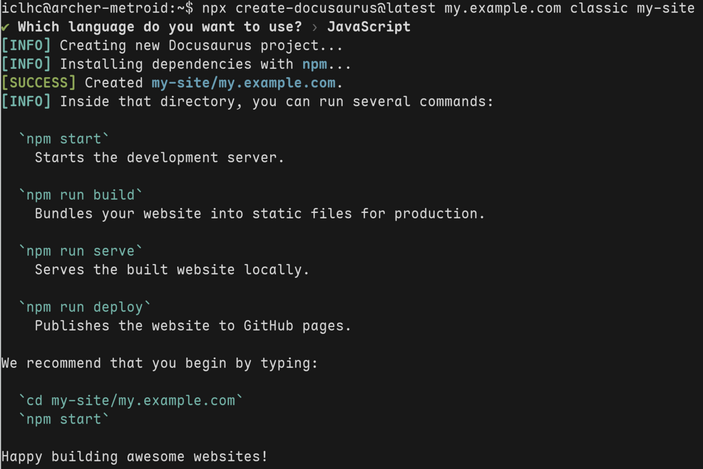
初始化一个 Docusaurus 项目
$ npx create-docusaurus@latest my.example.com classic my-site
项目结构如下
.
|-- README.md
|-- docs
|-- blog
|-- src
|   |-- components
|   |-- css
|   `-- pages
|-- sidebars.js
|-- docusaurus.config.js
|-- node_modules
|-- package-lock.json
|-- package.json
`-- static
docs:包含文档的Markdown文件。blog:包含博客的Markdown文件。src:非文档页包括自定义React组件、独立页面等。/src/pages:独立页面(可以使用.jsx/.md/.mdx)。
static:静态文件(图片),所有内容在构建时都会复制到build目录。package.json:Docusaurus 站点是一个 React 应用,可以像开发其他网站一样安装任何包。docusaurus.config.js:站点的主配置文件。sidebars.js:文档页面的侧边栏配置。
运行开发服务器,默认使用 3000 端口
npm run start
在浏览器打开 http://localhost:3000 查看
Docusaurus 是一个静态站点生成器,因此需要构建再托管到 Web 服务器(Caddy 或者 Nginx)
npm run build
构建的内容放在 ./build目录
基础配置
docusaurus.config.js 是站点的配置文件
有 3 个必须设置的字段
-
title:网站的标题 -
url:网站的域名假设部署到以下域名
https://my-site.github.io,就需要这样配置
export default {
  url: 'https://my-site.github.io',
}; -
baseUrl:网站的路径,允许你在域名子路径上部署网站。假设要在
https://my-site.github.io/docs下托管网站就进行如下设置export default {
baseUrl: '/docs',
};
还有一些常用字段
-
favicon:网站图标 -
tagline:网站标语 -
部署相关
organizationName:GitHub 用户或组织projectName:GitHub 仓库名
-
主题、插件、预设(preset)
export default {
  // ...
  plugins: [
    [
      'content-blog',
      {
        path: 'blog',
        routeBasePath: 'blog',
        include: ['*.md', '*.mdx'],
        // ...
      },
    ],
    'content-pages',
  ],
  themes: ['@docusaurus/theme-classic'],
  presets: [
      [
      '@docusaurus/preset-classic',
      {
        docs: {
          sidebarPath: './sidebars.js',
        },
        theme: {
          customCss: ['./src/css/custom.css'],
        },
      },
  ],
};-
plugins:在 Docusaurus 中提供功能的模块 -
theme -
preset:一组插件的集合,classic预设包括@docusaurus/plugin-content-docs等插件为预设(preset)中的插件配置选项
docs和blog中的editUrl选项,是 Github 仓库的地址
export default {
  // ...
  presets: [
    [
      '@docusaurus/preset-classic',
      {
        docs: {
          sidebarPath: './sidebars.js',
          editUrl:
          'https://github.com/WheelsLab/doc/tree/master',
        },
        blog: {
          editUrl:
          'https://github.com/WheelsLab/doc/tree/master',
        }
        theme: {
          customCss: ['./src/css/custom.css'],
        },
      },
    ],
  ],
};
-
可以在 React 组件中访问这些配置
import React from 'react';
import useDocusaurusContext from '@docusaurus/useDocusaurusContext';

const Hello = () => {
  const {siteConfig} = useDocusaurusContext();
  const {title, tagline} = siteConfig;

  return <div>{`${title} · ${tagline}`}</div>;
};
文档
站点已经创建好了,来新增一些文档吧。
文档功能由 plugin-content-docs 插件提供(classic 预设已经包含此插件),文档插件会自动读取 docs 目录的内容用于生成文档页。
下面在 docs 目录下新建一个文档 greeting.md
website # root directory of your site
├── docs
│   └── greeting.md
├── src
│   └── pages
├── docusaurus.config.js
├── ...
文档是一个 Markdown 文件以 .md 或者 .mdx 结尾,支持 CommonMark 规范。greeting.md 的内容如下,
---
description: Create a doc page with rich content.
---

# Hello from Docusaurus

Are you ready to create the documentation site for your open source project?

## Headers

will show up on the table of contents on the upper right

So that your users will know what this page is all about without scrolling down or even without reading too much.

## Only h2 and h3 will be in the TOC by default.

You can configure the TOC heading levels either per-document or in the theme configuration.

The headers are well-spaced so that the hierarchy is clear.

- lists will help you
- present the key points
- that you want your users to remember
  - and you may nest them
    - multiple times
一个 Markdown 文档可以分为两个部分——元信息和正文:
-
元信息:也叫作前置信息(front matter),文档顶部以三个短横线
---分割的内容就是文档元信息,有许多配置项可设置(完整的配置见文档 markdown-front-matter)。id:文档的唯一标识符,默认是不带扩展名的文件路径。title:标题,默认是 Markdown 的一级标题或者文档id。sidebar_label:侧边栏中,文档的名称,默认是title。sidebar_position:文档在侧边栏中,出现的位置。toc_min_heading_level:目录显示的层级,最小值。toc_max_heading_level:目录显示的层级,最大值。slug:自定义文档的 URL,默认是文档的路径。draft:标记为草稿,只会在启动开发服务器时构建。tag:文档拥有的标签,标签存放在docs/tags.yml文件中,这个文件集中了所有文档会使用的标签。也有一些内建标签比如Release引用它们不需要在tags.yml中定义。如果引用了不存在的 tag,Ducusaurus 会直接抛异常。
一个典型的 Front Matter
---
id: doc-markdown
title: Docs Markdown Features
hide_title: false
hide_table_of_contents: false
sidebar_label: Markdown
sidebar_position: 3
pagination_label: Markdown features
custom_edit_url: https://github.com/facebook/docusaurus/edit/main/docs/api-doc-markdown.md
description: How do I find you when I cannot solve this problem
keywords:
  - docs
  - docusaurus
tags: [docusaurus]
image: https://i.imgur.com/mErPwqL.png
slug: /myDoc
last_update:
  date: 1/1/2000
  author: custom author name
---

# Markdown Features

My Document Markdown content -
正文部分:这个就是文档本身了,这里的 Markdown 格式除了支持 CommonMark 规范外,还支持扩展的 MDX 格式,允许在 Markdown 中插入
React组件。
合理组织文档结构
Docusaurus 会自动根据 docs 目录的结构生成访问文档页面的 URL 以及侧边栏。因此有必要规划一个良好的目录结构。侧边栏的配置可以通过文档的 Front Matter 设置或者在 sidebar.js 中配置。
假设 docs 目录结构如下
website # Root directory of your site
└── docs
   ├── greeting.md
   └── guide
      └── hello.md
文档 id
每个文档都有一个 id,用于唯一标识该文档,默认是文档文件相对于 docs 目录的路径名(不带扩展)。比如 website/docs/guide/hello.md 的 id 就是 guide/hello。
此外,文档 id 的最后一部分可以通过 Fronter Matter 自定义,比如在 hello.md 的 Front Matter 中添加如下内容
---
id: part1
---
helld.md 的 id 就是 guide/part1
文档 URL(slug)
每个文档都有对应的 URL 地址,用于访问该文档。默认的 URL 是根据 id 生成的,而 id 又是根据目录结构生成。
下面 hello.md 的 URL 就是 /docs/guide/hello
website # Root directory of your site
└── docs
    └── guide
        └── hello.md
有 3 种特殊情况,文件名不会出现在 URL 中:
下面三种情况下 URL 都是
/docs/Guide
- 文档名为
index(不区分大小写):docs/Guides/index.md - 文档名为
README(不区分大小写):docs/Guides/README.mdx - 文档名和目录名相同:
docs/Guides/Guides.md
当然 URL 也是可以通过 Front Matter 定制的,上面的 hello.md 默认生成的 URL 是 /docs/guide/hello,下面定制为 /docs/boujour
---
slug: /bonjour
---
slug 会添加到文档根 URL(routeBasePaht) 之后,默认是 /docs。如果需要从 URL 中去掉 /docs 这部分请参考仅文档模式。
文档侧边栏(sidebar.js)
侧边栏可以自动生成(推荐)或者手动配置,自动侧边栏功能的完整信息参考文档 Autogenerated。
下面简要介绍下自动侧边栏的使用。
自动生成的侧边栏是根据 docs 目录的结构决定的:每个文件夹都会创建一个类别项(Category),每个文件都会创建一个文档项(Doc)
类别项在侧边栏中是一个下拉列表,列表中的每一项是文档项或者嵌套的类别项。
侧边栏的基本组成
sidebar.js 导出了侧边栏对象,配置项由 doc/category/autogenerated 组成(Sidebar 可包含的所有可用项见文档 Sidebar item)
autogenerated:自动生成项,会展开为包含文档项和类别项的列表。可以在配置时与文档项与类别项混合使用。type SidebarItemAutogenerated = {
type: 'autogenerated';
dirName: string; // Source folder to generate the sidebar slice from (relative to docs)
};参数
dirName用于指定文档目录路径。
doc:文档项,在侧边栏中链接到一个文档。type SidebarItemDoc =
// Normal syntax
| {
type: 'doc';
id: string;
label: string; // Sidebar label text
key?: string; // Sidebar key to uniquely identify the item
className?: string; // Class name for sidebar label
customProps?: Record<string, unknown>; // Custom props
}
// Shorthand syntax
| string; // docId shortcut有两种配置语法,短语法只需要指定文档
idexport default {
mySidebar: [
// Normal syntax:
{
type: 'doc',
id: 'doc1', // document ID
label: 'Getting started', // sidebar label
},
// Shorthand syntax:
'doc2', // document ID
],
};
category:类别项,包含多个文档id的列表,在侧边栏中表现为下拉菜单。type SidebarItemCategory = {
type: 'category';
label: string; // Sidebar label text.
items: SidebarItem[]; // Array of sidebar items.
description?: string;
key?: string;
className?: string;
customProps?: Record<string, unknown>;
// Category options:
collapsible: boolean; // Set the category to be collapsible
collapsed: boolean; // Set the category to be initially collapsed or open by default
link: SidebarItemCategoryLinkDoc | SidebarItemCategoryLinkGeneratedIndex;
};类别项的典型配置
export default {
  docs: [
    {
      type: 'category',
      label: 'Guides',
      collapsible: true,
      collapsed: false,
      items: [
        'creating-pages',
        {
          type: 'category',
          label: 'Docs',
          items: ['introduction', 'sidebar', 'markdown-features', 'versioning'],
        },
      ],
    },
  ],
};
也支持短语法
export default {
  docs: {
    Guides: [
      'creating-pages',
      {
        Docs: ['introduction', 'sidebar', 'markdown-features', 'versioning'],
      },
    ],
  },
};
类别项也可以具有文档,即类别索引文档(category index doc),后面会介绍。
const sidebars = {
  // By default, Docusaurus generates a sidebar from the docs folder structure
  tutorialSidebar: [{type: 'autogenerated', dirName: '.'}],

  // But you can create a sidebar manually
  /*
  tutorialSidebar: [
    'intro',
    'hello',
    {
      type: 'category',
      label: 'Tutorial',
      items: ['tutorial-basics/create-a-document'],
    },
  ],
   */
};
类别索引文档
category 项除了是包含 doc 的列表外,本身也可以链接到一个文档,即类别索引文档(category index doc)。命名约定如下:
- 文档名为
index的是类别索引文档:比如docs/Guides/index.md - 文档名为
README是索引文档:比如docs/Guides/README.mdx - 文档名和目录相同的是索引文档:比如
docs/Guides/Guides.md
除了利用命名约定外,还可以手动指定类别索引文档
export default {
  docs: [
    {
      type: 'category',
      label: 'Guides',
      link: {type: 'doc', id: 'Guides/index'},
      items: [],
    },
  ],
};
侧边栏相关的文档元数据
自动生成的侧边栏其文档名或者类别名以及位置一般不符合个人需求,可以通过 Front Matter 进行配置
sidebar_position:文档项在侧边栏出现的顺序sidebar_label:文档项在侧边栏中的名称
---
sidebar_position: 2
sidebar_label: Easy
sidebar_class_name: green
sidebar_key: unique-sidebar-item-key
---

# Easy Tutorial

This is the easy tutorial!
类别项元数据
可以在文件夹中创建 _category_.json 或者 _category_.yml 设置类别项的元数据
position:类别项出现在侧边栏中的顺序。label:类别项在侧边栏中的名称。
{
  "position": 2.5,
  "label": "Tutorial",
  "key": "unique-sidebar-item-key",
  "collapsible": true,
  "collapsed": false,
  "className": "red",
  "link": {
    "type": "generated-index",
    "title": "Tutorial overview"
  },
  "customProps": {
    "description": "This description can be used in the swizzled DocCard"
  }
}
可以通过
link指定类别索引文档,如果_category_.json位于guides目录中,则如下配置会寻找/docs/guides/intro.md,如果不存在就使用/docs/intro.md"link": {"type": "doc", "id": "intro"}
Markdown 支持
Docusaurus 使用 Markdown 书写文档/博客/独立页面。实际上 Docusaurus 会在背后把 .md 和 .mdx 都转换为 React 组件
基本的 CommonMark 语法非常简单可以在 10 分钟内学会。
如果计划使用 CommonMark,推荐
siteConfig.markdown.format: 'detect'设置。系统将根据文件扩展名自动选择合适的格式:
.md文件将使用 CommonMark 格式<.mdx>文件将使用 MDX 格式
常见用法
-
基本语法
### My Doc Section
Hello world message with some **bold** text, some _italic_ text, and a [link](/)
 -
Front Matter(元信息):doc/blog/page 插件使用不同的格式
---
title: My Doc Title
more_data:
  - Can be provided
  - as: objects
    or: arrays
--- -
<details>元素:可展开的详情### Details element example
<details>
<summary>Toggle me!</summary>
This is the detailed content
```js
console.log("Markdown features including the code block are available");
```
You can use Markdown here including **bold** and _italic_ text, and [inline link](https://docusaurus.io)
<details>
<summary>Nested toggle! Some surprise inside...</summary>
😲😲😲😲😲
</details>
</details>
MDX
MDX 是 Markdown 的一种扩展,可以在 Markdown 中嵌入 React 组件。
可重用组件推荐放在 src/components/ 中
比如声明一个组件 src/components/Highlight.jsx
import React from 'react';

export default function Highlight({children, color}) {
  return (
    <span
      style={{
        backgroundColor: color,
        borderRadius: '2px',
        color: '#fff',
        padding: '0.2rem',
      }}>
      {children}
    </span>
  );
}
在某个 MDX 文档中就可以使用
import Highlight from '@site/src/components/Highlight';

<Highlight color="#25c2a0">Docusaurus green</Highlight>
Docusaurus 支持的完整 MDX 特性参考文档 MDX and React
Tabs(可切换的选项卡)
多个选项
import Tabs from '@theme/Tabs';
import TabItem from '@theme/TabItem';

<Tabs>
  <TabItem value="apple" label="Apple" default>
    This is an apple 🍎
  </TabItem>
  <TabItem value="orange" label="Orange">
    This is an orange 🍊
  </TabItem>
  <TabItem value="banana" label="Banana">
    This is a banana 🍌
  </TabItem>
</Tabs>
同时切换的多个选项卡
<Tabs groupId="operating-systems">
  <TabItem value="win" label="Windows">Use Ctrl + C to copy.</TabItem>
  <TabItem value="mac" label="macOS">Use Command + C to copy.</TabItem>
</Tabs>

<Tabs groupId="operating-systems">
  <TabItem value="win" label="Windows">Use Ctrl + V to paste.</TabItem>
  <TabItem value="mac" label="macOS">Use Command + V to paste.</TabItem>
</Tabs>
自定义选项卡样式
<Tabs className="unique-tabs">
  <TabItem value="Apple">This is an apple 🍎</TabItem>
  <TabItem value="Orange">This is an orange 🍊</TabItem>
  <TabItem value="Banana">This is a banana 🍌</TabItem>
</Tabs>
通过 style.module.css 定义样式
import styles from './styles.module.css';

<Tabs>
  <TabItem value="apple" label="Apple" attributes={{className: styles.red}}>
    This is an apple 🍎
  </TabItem>
  <TabItem value="orange" label="Orange" attributes={{className: styles.orange}}>
    This is an orange 🍊
  </TabItem>
  <TabItem value="banana" label="Banana" attributes={{className: styles.yellow}}>
    This is a banana 🍌
  </TabItem>
</Tabs>
// style.module.css
.red {
  color: red;
}
.red[aria-selected='true'] {
  border-bottom-color: red;
}

.orange {
  color: orange;
}
.orange[aria-selected='true'] {
  border-bottom-color: orange;
}

.yellow {
  color: yellow;
}
.yellow[aria-selected='true'] {
  border-bottom-color: yellow;
}
Code blocks(代码块高亮)
标题,通过 title 指定
```jsx title="/src/components/HelloCodeTitle.js"
function HelloCodeTitle(props) {
  return <h1>Hello, {props.name}</h1>;
}
```
语法高亮,通过指定语言名
```js
console.log('Every repo must come with a mascot.');
```
高亮主题,通过 themeConfig.prism.theme 配置
Prism(通常指 Prism.js) 是一个前端语法高亮引擎,主要用于在网页中对代码块进行词法解析(tokenization)并渲染为可高亮的 HTML 结构。
import {themes as prismThemes} from 'prism-react-renderer';

export default {
  themeConfig: {
    prism: {
      theme: prismThemes.github,
      darkTheme: prismThemes.dracula,
    },
  },
};
支持的语言,通过 themeConfig.prism.additionalLanguages 配置。Prism 支持的语言列表见 Supported Languages
一些流行的语言,如 Java、C# 或 PHP,默认情况下未启用。
export default {
  // ...
  themeConfig: {
    prism: {
      additionalLanguages: ['powershell', 'c', 'cpp', 'java'],
    },
    // ...
  },
};
代码行高亮,使用 highlight-next-line、highlight-start、highlight-end 标记需要高亮的代码行
支持多种语法
样式 语法 C 风格 /* ... */和// ...JSX 风格 {/* ... */}Bash 风格 # ...HTML 风格 <!-- ... -->自定义高亮颜色
src/css/custom.css:root {
--docusaurus-highlighted-code-line-bg: rgb(72, 77, 91);
}
/* If you have a different syntax highlighting theme for dark mode. */
[data-theme='dark'] {
/* Color which works with dark mode syntax highlighting theme */
--docusaurus-highlighted-code-line-bg: rgb(100, 100, 100);
}
```js
function HighlightSomeText(highlight) {
  if (highlight) {
    // highlight-next-line
    return 'This text is highlighted!';
  }

  return 'Nothing highlighted';
}

function HighlightMoreText(highlight) {
  // highlight-start
  if (highlight) {
    return 'This range is highlighted!';
  }
  // highlight-end

  return 'Nothing highlighted';
}
```
可以添加自定义魔法注释
- docusaurus.config.js
- src/css/custom.css
- myDoc.md
export default {
  themeConfig: {
    prism: {
      magicComments: [
        // Remember to extend the default highlight class name as well!
        {
          className: 'theme-code-block-highlighted-line',
          line: 'highlight-next-line',
          block: {start: 'highlight-start', end: 'highlight-end'},
        },
        {
          className: 'code-block-error-line',
          line: 'This will error',
        },
      ],
    },
  },
};
.code-block-error-line {
  background-color: #ff000020;
  display: block;
  margin: 0 calc(-1 * var(--ifm-pre-padding));
  padding: 0 var(--ifm-pre-padding);
  border-left: 3px solid #ff000080;
}
In JavaScript, trying to access properties on `null` will error.

```js
const name = null;
// This will error
console.log(name.toUpperCase());
// Uncaught TypeError: Cannot read properties of null (reading 'toUpperCase')
```
显示代码行号,在语言后面跟 showLineNumbers 以启用行号
```jsx showLineNumbers
import React from 'react';

export default function MyComponent(props) {
  return <div>Foo</div>;
}
```
默认从 1 开始计数,可以通过 showLineNumbers=3 更改
```jsx showLineNumbers=3
export default function MyComponent(props) {
  return <div>Foo</div>;
}
```
Admonition(警示块)
:::note

Some **content** with _Markdown_ `syntax`. Check [this `api`](#).

:::

:::tip

Some **content** with _Markdown_ `syntax`. Check [this `api`](#).

:::

:::info

Some **content** with _Markdown_ `syntax`. Check [this `api`](#).

:::

:::warning

Some **content** with _Markdown_ `syntax`. Check [this `api`](#).

:::

:::danger

Some **content** with _Markdown_ `syntax`. Check [this `api`](#).

:::
嵌套警示块
:::::info[Parent]

Parent content

::::danger[Child]

Child content

:::tip[Deep Child]

Deep child content

:::

::::

:::::
警示块中嵌套 MDX
import Tabs from '@theme/Tabs';

import TabItem from '@theme/TabItem';

:::tip[Use tabs in admonitions]

<Tabs>
  <TabItem value="apple" label="Apple">This is an apple 🍎</TabItem>
  <TabItem value="orange" label="Orange">This is an orange 🍊</TabItem>
  <TabItem value="banana" label="Banana">This is a banana 🍌</TabItem>
</Tabs>

:::
jsx 中使用警示块
import Admonition from '@theme/Admonition';

export default function MyReactPage() {
  return (
    <div>
      <Admonition type="info">
        <p>Some information</p>
      </Admonition>
    </div>
  );
}
Table of contents(标题和目录)
Docusaurus 会根据 Markdown 标题自动生成目录条目。
每个标题都有一个 ID,方便在 Markdown 或者 JSX 中引用
[link](#heading-id)
<Link to="#heading-id">link</Link>
标题 ID 是根据标题文本自动生成的,比如 ### Hello World 的 ID 为 hello-world。
自动生成的 ID 可能不符合需求,可以手动指定一个 ID
### Hello World {#my-explicit-id}
目录中默认仅显示 h2 和 h3 标题,可以利用 Front Matter 自定义每个文档的目录标题层级。
---
# Display h2 to h5 headings
toc_min_heading_level: 2
toc_max_heading_level: 5
---
可以设置所有页面的标题层级
export default {
  themeConfig: {
    tableOfContents: {
      minHeadingLevel: 2,
      maxHeadingLevel: 5,
    },
  },
};
可以在文档中显示目录
import TOCInline from '@theme/TOCInline';

<TOCInline toc={toc} />
Assets (静态资源)
插入图片,相对路径

引用文件
# My Markdown page

<a target="\_blank" href={require('./assets/docusaurus-asset-example.docx').default}> Download this docx </a>

or

[Download this docx using Markdown](./assets/docusaurus-asset-example.docx)
插入 SVG 图片
import DocusaurusSvg from './docusaurus.svg';

<DocusaurusSvg />;
主题图片,可根据当前颜色模式自动切换
import useBaseUrl from '@docusaurus/useBaseUrl';
import ThemedImage from '@theme/ThemedImage';

<ThemedImage
  alt="Docusaurus themed image"
  sources={{
    light: useBaseUrl('/img/docusaurus_light.svg'),
    dark: useBaseUrl('/img/docusaurus_dark.svg'),
  }}
/>;
主题图片(Github 风格)
[data-theme='light'] img[src$='#gh-dark-mode-only'],
[data-theme='dark'] img[src$='#gh-light-mode-only'] {
  display: none;
}
使用绝对路径引用静态资源,下面引用的是 website/static/img/docusaurus.png

Markdown Link(链接到其他页面)
- [URL path to another document](./installation)
- [file path to another document](./installation.mdx)
相对引用
[link](./target.mdx)[llink](../target.mdx)[link](target.mdx)
绝对引用
[link](/target.mdx)[link](/docs/target.mdx)[link](@site/docs/target.mdx)
MDX Plugin (自定义 Markdown 语法)
可以创建一个 MDX Plugin 以扩展现有 Markdown 语法。
Docusaurus 提供的 MDX 特性是也是通过 MDX 插件系统实现的。
可以安装或者自己设计 MDX 插件
Math Equations(数学公式)
Docusaurus 利用 KaTeX 提供 LaTeX 公式支持
启用 KaTeX
npm install --save remark-math@6 rehype-katex@7
配置插件
import remarkMath from 'remark-math';
import rehypeKatex from 'rehype-katex';

export default {
  presets: [
    [
      '@docusaurus/preset-classic',
      {
        docs: {
          path: 'docs',
          remarkPlugins: [remarkMath],
          rehypePlugins: [rehypeKatex],
        },
      },
    ],
  ],
};
添加 CSS 样式
export default {
  //...
  stylesheets: [
    {
      href: 'https://cdn.jsdelivr.net/npm/katex@0.13.24/dist/katex.min.css',
      type: 'text/css',
      integrity:
        'sha384-odtC+0UGzzFL/6PNoE8rX/SPcQDXBJ+uRepguP4QkPCm2LBxH3FA3y+fKSiJ+AmM',
      crossorigin: 'anonymous',
    },
  ],
};
内联公式
Let $f\colon[a,b]\to\R$ be Riemann integrable. Let $F\colon[a,b]\to\R$ be
$F(x)=\int_{a}^{x} f(t)\,dt$. Then $F$ is continuous, and at all $x$ such that
$f$ is continuous at $x$, $F$ is differentiable at $x$ with $F'(x)=f(x)$.
公式块
$$
I = \int_0^{2\pi} \sin(x)\,dx
$$
Mermaid(流程图)
Docusaurus 利用 mermaid 提供流程图支持,安装插件 @docusaurus/theme-mermaid
npm install --save @docusaurus/theme-mermaid
添加配置
export default {
  markdown: {
    mermaid: true,
  },
  themes: ['@docusaurus/theme-mermaid'],
};
使用
```mermaid
graph TD;
    A-->B;
    A-->C;
    B-->D;
    C-->D;
```
Style and Layout(样式和布局)
Docusaurus 本身就是一个单页 web 应用(Single-Page React App),因此可使用多种方式调整 CSS 样式。
如果使用的是经典预设模板 @docusaurus/preset-classic,可以创建一个 CSS 样式表设置全局样式。
创建全局样式表 website/src/css/custom.css
.purple-text {
  color: rebeccapurple;
}
然后在配置文件中引入
export default {
  // ...
  presets: [
    [
      '@docusaurus/preset-classic',
      {
        theme: {
          customCss: ['./src/css/custom.css'],
        },
      },
    ],
  ],
};
任何 CSS name 都可以全局使用
function MyComponent() {
  return (
    <main>
      <h1 className="purple-text">Purple Heading!</h1>
    </main>
  );
}
如果需要更改任何 HTML 元素的样式,可以使用浏览器开发者工具(DevTools)检查元素的类名(class name)。Docusaurus 中有以下几种类名
-
主题类名:Docusaurus 提供的稳定类名,要设置样式时推荐使用这些。
-
Infima 类名:
classic预设使用 Infima 作为 CSS 框架,通常这些类名也是稳定的,但这属于 Docusaurus 内部实现。下面是当使用
create-docusaurus脚手架创建项目时的默认 CSS 配置,每种颜色有 7 个色调。可以使用这里的调色板:https://docusaurus.io/docs/styling-layout#styling-your-site-with-infima
website/src/css/custom.css:root {
--ifm-color-primary: #2e8555;
--ifm-color-primary-dark: #29784c;
--ifm-color-primary-darker: #277148;
--ifm-color-primary-darkest: #205d3b;
--ifm-color-primary-light: #33925d;
--ifm-color-primary-lighter: #359962;
--ifm-color-primary-lightest: #3cad6e;
--ifm-code-font-size: 95%;
--docusaurus-highlighted-code-line-bg: rgba(0, 0, 0, 0.1);
}
/* For readability concerns, you should choose a lighter palette in dark mode. */
[data-theme='dark'] {
--ifm-color-primary: #25c2a0;
--ifm-color-primary-dark: #21af90;
--ifm-color-primary-darker: #1fa588;
--ifm-color-primary-darkest: #1a8870;
--ifm-color-primary-light: #29d5b0;
--ifm-color-primary-lighter: #32d8b4;
--ifm-color-primary-lightest: #4fddbf;
--docusaurus-highlighted-code-line-bg: rgba(0, 0, 0, 0.3);
} -
CSS 模块类名:其他所有元素使用的类名,这些类名都以
hash结束(比如codeBlockContainer_RIuc),经常变动。
Swizzle(魔改 React 组件)
在上一节中,我们已经可以通过 CSS 定义主题样式了,但这可能还不够,Docusaurus 提供了一个交互式 CLI 用于魔改组件(swizzling)。
npm run swizzle
列出所有可魔改组件
npm run swizzle -- --list
有两种魔改方式
-
弹出:复制一份组件源码,可用于彻底重写组件
npm run swizzle [theme name] [component name] -- --eject -
包装:使用一个组件包装器,增强原始组件的功能
npm run swizzle [theme name] [component name] -- --wrap
并不是所有组件都是可修改的,Docusaurus 将组件可修改程度,分为 3 个类别:
-
Safe:可自由修改的组件,拥有一个稳定的 API,主要版本的升级也不会带来破坏性变更。 -
UnSafe:可以修改,和主题的内部实现相关,但升级后可能不兼容信息不要害怕修改
UnSafe的组件,只需要记住破坏性变更可能发生,你可能需要在升级次版本后手动升级定制。 -
Forbidden:禁止修改
如何定位需要自定义(swizzle)的主题组件?
@docusaurus/theme-classic 提供了大约 100 个组件,当需要修改页面上的某一小块 UI 时,很容易不知到是由哪个组件渲染的。首先可以查看可以魔改组件的列表
npm run swizzle @docusaurus/theme-classic -- --list
swizzle 输出的列表中,会对某些组件简要说明。此外 Docusaurus 使用了语义化的组件命名,可以方便推断其用途。
页面的渲染通常不是由一个组件完成,而是组件树。所有页面类型都有一个顶层组件,我们可以从顶层开始 swizzle 看看导出了哪些组件,然后逐级向下 swizzle 直到找到需要的组件。
- 先
swizzle顶层组件 - 查看它
import了哪些组件 - 一层一层向下查找,直到命中想要改的那块
- 删掉无用的
swizzle文件(unswizzle),避免维护一堆未改动的组件
部署
Github Pages
编辑配置文件,设置 Github 仓库信息
GitHub Pages 默认会为 Docusaurus URL 添加一个尾斜线。建议设置一个 trailingSlash 配置项(true 或 false,而不是 undefined)。
export default {
  // ...
  url: 'https://endiliey.github.io', // Your website URL
  baseUrl: '/',
  projectName: 'endiliey.github.io',
  deploymentBranch: 'gh-pages'
  organizationName: 'endiliey',
  trailingSlash: false,
  // ...
};
projectName:仓库名organizationName:Github 用户名deploymentBranch:部署分支的名称,默认是gh-pages
构建站点并推送到部署分支
GIT_USER=<GITHUB_USERNAME> npm run deploy
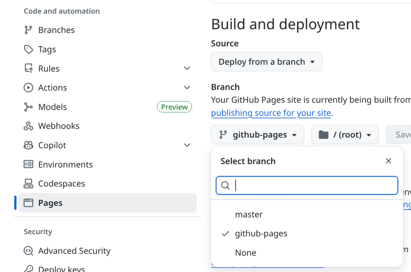
最后,需要到仓库的设置里选择部署分支,然后再等个几分钟就可以访问了